Beach Flowers at Aberdeen city Beach
I wanted to try to keep this blog to a reasonable ratio of theory and practical posts. Now bearing in mind that, I am putting up a process series of pictures from a painting I did the other day. I actually don't think it's a very successful painting, but an important part of learning is to look at your work and try to analyze your mistakes and omissions, and it would be remiss of me to post only when I think I have done a really good job.

After doing a light drawing as a guide, and adapting it from my reference material, I used a brush and dilute Indian ink to sketch out the darks in the image.
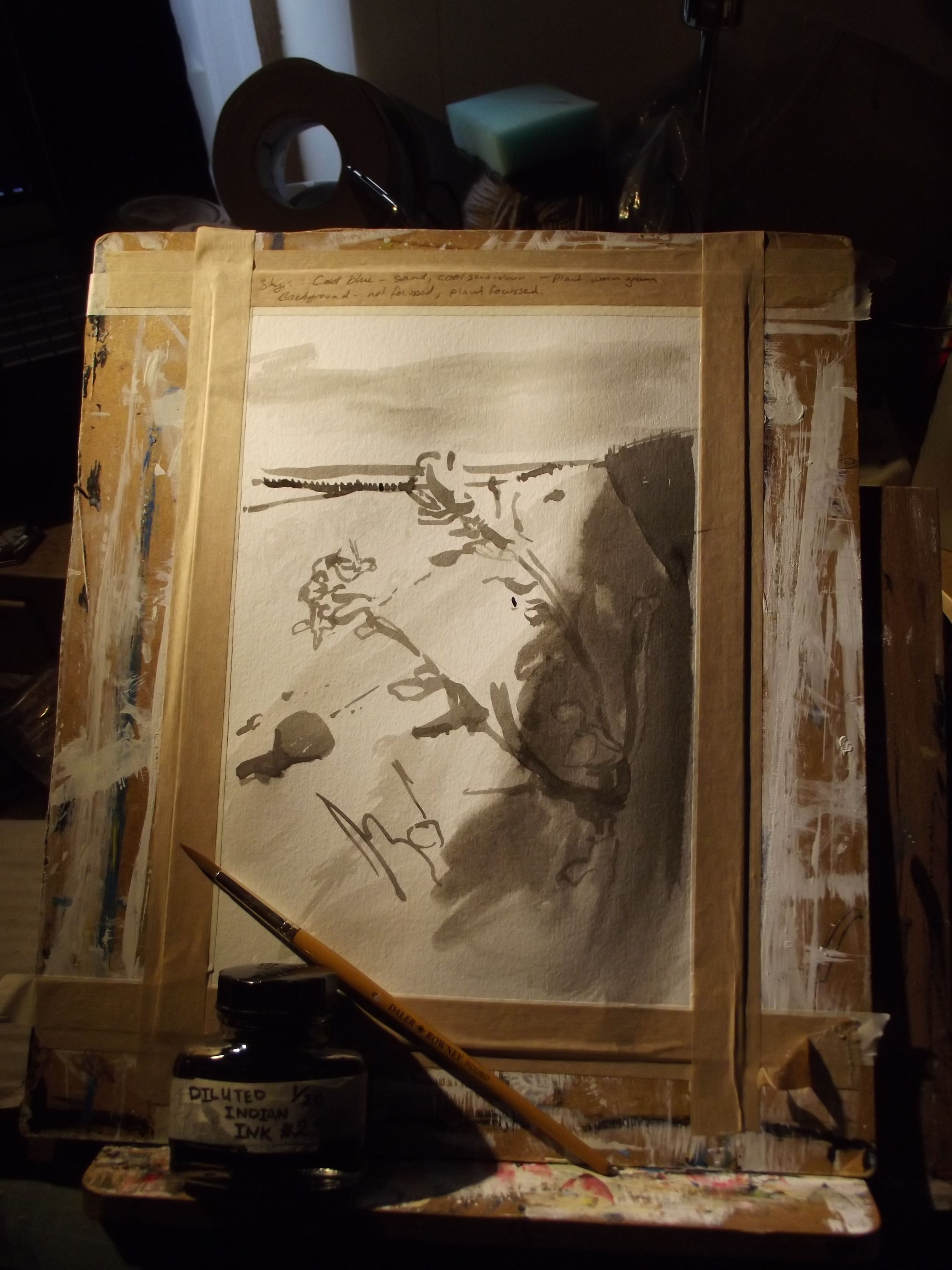
In this drawing I have used washes of the dilute Indian Ink to establish more of the tone. I use the Indian ink as it will still show through the early layers of acrylic paint, allowing me to still see the guides later. \As you can see at the top of the paper, I wrote myself little notes on the masking tape to help me remember what I wanted to do with the colour.

After an initial wash of Pthalo blue acrylic, I then washed in a sandy colour made mostly from raw umber and yellow ochre. I also spent a little time dabbing at the sky area to change how the paint sat, and allow some of the white to show through more than other areas.

In this image I have worked on the sky area as the first bit after the establishing work. When painting in opaque acrylics like this, it is commonly recommended that one generally should paint from the furthest back thing to the frontmost thing, so the sky is what happens first. The sky doesn't get much more than tweaks after this stage.

At this point I have stared to work on the sea area, the shore in the background, and the beach area behind the plant. A lot of it is trying to bash in the colours about right, and working different sorts of colours into the whole thing, greens and ochres and blues and umbers, etc to try to give the thing some texture
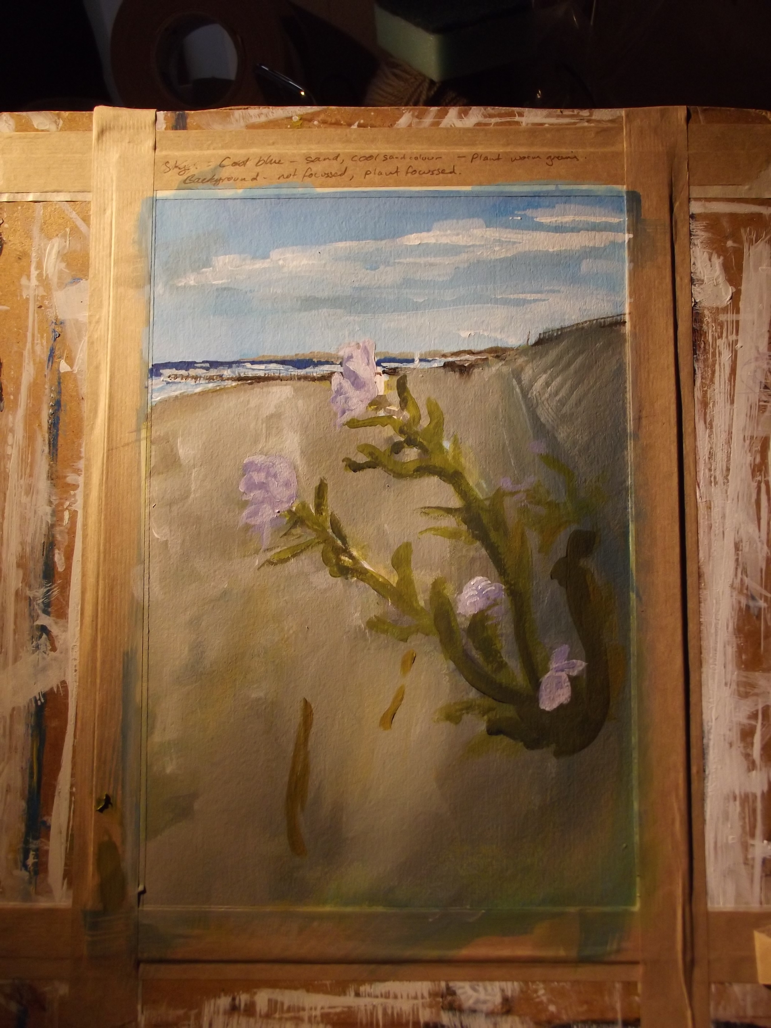
The plant in the foreground was starting to get a bit obscured so I re-established it with some simple colour, trying to redraw it from the source material rather than covering the ink lines I could see.

This was a really long step- adding the rocks and debris on the beach area, and trying to work in lots of shadow tone and texture so it's interesting to look at. Only the foreground and a few details to go after this!

This is a scan of the work once finished rather than a photo, which is why it looks so different - my scanner seems to have a super bright light that washes out things a bit. as you can se, I have worked more contrast into the plant in the foreground, adding in the highlights and a variety of shades of green for texture and fun
Learning conclusions:
The Bad: What really strikes me about the final image is that the foreground flower barely seems to stand out at all - and to fix that, I need to be more careful about arranging a strong contrast in both colour and tone. Having strong tonal contrasts always makes everything look better, and I really haven't managed it. I think doing a careful, through underpainting in burnt sienna and umber would probably do the trick, but will add a lot of time to the work, as I would basically be painting it twice. Still, that's the price of painting.
I also think that it would have worked better in a square painting, rather than a rectangular one. Although I put some work into planning the composition, I thought it would turn out better than I think it dd - and for some reason I think that square would suit it better; chopping off the extraneous bit of boring foreground at the bottom would probably give the composition better balance overall.
Probably the colour of the sea is wrong. It looks too intensely blue, although I promise it was super blue when I saw it. It's one of these things that's needed by artists - not slavish devotion to the source material but the judgement to interpret and alter the image in order to make it look better.
The Good: I like how the sky turned out, and planning the painting in stages really helped me work through it sensibly, rather than looking at it halfway through and wondering what to do. I also liked working lots of texture in all over the painting to contrast with the smooth plant stem and petals.
How I'll improve this: I'll be redrawing it with more sketching, and altered composition, worked up with careful eye on the tones before the colour goes in. At least with acrylics, you have the substantial advantage of a really fast drying time, so you can work in layers very quickly .